In the series of Azure Machine Learning posts:
- Dec 01: What is Azure Machine Learning?
- Dec 02: Creating Azure Machine Learning Workspace
- Dec 03: Understanding Azure Machine Learning Studio
- Dec 04: Getting data to Azure Machine Learning workspace
- Dec 05: Creating compute and cluster instances in Azure Machine Learning
- Dec 06: Environments in Azure Machine Learning
- Dec 07: Introduction to Azure CLI and Python SDK
- Dec 08: Python SDK namespaces for workspace, experiments and models
- Dec 09: Python SDK namespaces for environment, and pipelines
- Dec 10: Connecting to client using Python SDK namespaces
- Dec 11: Creating Pipelines with Python SDK
- Dec 12: Creating jobs
- Dec 13: Automated ML
- Dec 14: Registering the models
- Dec 15: Getting to know MLflow
- Dec 16: MLflow in action with xgboost
- Dec 17: Building responsible AI dashboard with Python SDK
Azure Machine Learning is also a great tool to do ordinary statistical analysis, graph plotting and everything that goes along.
Let’s get an open dataset, that is available on UCI Machine Learning repository and import it in the pandas dataframe.
We can also first save it to the notebook:
import pandas as pd
df = pd.read_csv('http://archive.ics.uci.edu/ml/machine-learning-databases/statlog/german/german.data', delimiter=' ',header=None)
df.columns=['account_bal','duration','payment_status','purpose',
                   'credit_amount','savings_bond_value','employed_since',
                   'installment_rate','sex_marital','guarantor','residence_since',
                   'most_valuable_asset','age','concurrent_credits','type_of_housing',
                   'number_of_exist_cr','job','number_of_dependents','telephone',
                   'foreign','target']

df= df.replace(['A11','A12','A13','A14', 'A171','A172','A173','A174','A121','A122','A123','A124'],
                  ['neg_bal','positive_bal','positive_bal','no_acc','unskilled','unskilled','skilled','highly_skilled',
                   'none','car','life_insurance','real_estate'])
We will be using the target variable further in analysis to check, how we can do the predictions. So let’s first check the missing values:
# check for missing values
df.isna().any().any()
And now the distribution of target variable:
from sklearn.preprocessing import LabelEncoder

le= LabelEncoder()
le.fit(df.target)
df.target=le.transform(df.target)
And check the loans:
loans_good_bad=round(((df.target.value_counts()/df.target.count())*100))
And we want to check the credits values, duration and age, and if there are big differences, we want to use the log() function on selected variables.
df[['credit_amount','duration','age']].describe()
So let’s do it on credit_amount.
df['credit_amount']=np.log(df['credit_amount'])
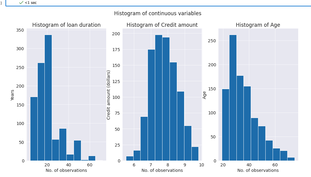
We can also draw the distributions for continuous variables:
fig, axes = plt.subplots(1,3, figsize=(16,8))
plt.suptitle('Histogram of continuous variables')
axes[0].hist(df['duration'])
axes[0].set_xlabel('No. of observations')
axes[0].set_ylabel('Years')
axes[0].set_title('Histogram of loan duration');

axes[1].hist(df['credit_amount'])
axes[1].set_xlabel('No. of observations')
axes[1].set_ylabel('Credit amount (dollars)')
axes[1].set_title('Histogram of Credit amount');

axes[2].hist(df['age'])
axes[2].set_xlabel('No. of observations')
axes[2].set_ylabel('Age')
axes[2].set_title('Histogram of Age');
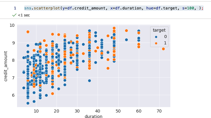
We can also analyse the relationship between credit amount and duration on a scatterplot.
sns.scatterplot(y=df.credit_amount, x=df.duration, hue=df.target, s=100, );
We can also check the risk for the credit (target variable) with job type (focusing on unemployed).
df.groupby('job')['target'].value_counts().unstack(level=1).plot.barh(stacked=True, figsize=(10, 6))
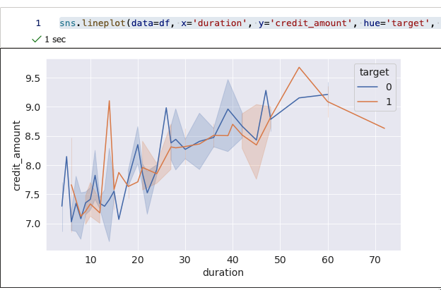
Or even create a line graph, showing credit amount and duration (same as Fig 2, just with a different graph type).
sns.lineplot(data=df, x='duration', y='credit_amount', hue='target', palette='deep');
Now, let’s do one-hot encoding for 15 features available in the dataset, so we can do further analysis. We will be using sklearn LabelEncoder function.
from sklearn.preprocessing import LabelEncoder

le = LabelEncoder()
le_count = 0

for col in df:
    if df[col].dtype == 'object':
        if len(list(df[col].unique())) <= 2:
            le.fit(df[col])
            df[col] = le.transform(df[col])
            le_count += 1

df = pd.get_dummies(df)
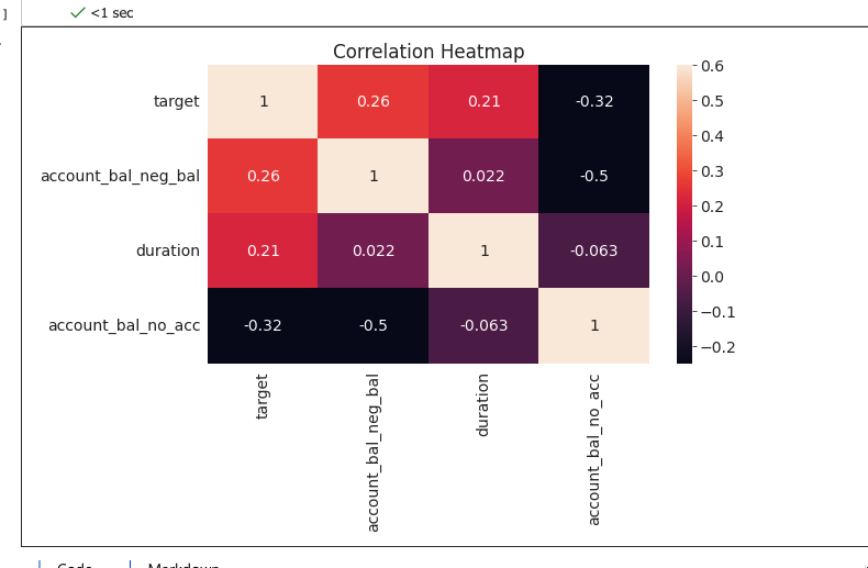
And now plot a heatmap
corr_data = df[['target', 'account_bal_neg_bal','duration','account_bal_no_acc']]
corr_data_corrs = corr_data.corr()

sns.heatmap(corr_data_corrs,  vmin = -0.25, annot = True, vmax = 0.6)
plt.title('Correlation Heatmap');
Tomorrow, we will continue with feature engineering and compare a couple of ML models. And we will see, that simple and advanced analysis can also be done in Azure ML.
Happy Advent of 2022!
Compete set of code, documents, notebooks, and all of the materials will be available at the Github repository: https://github.com/tomaztk/Azure-Machine-Learning


[…] Dec 18: Statistical analysis, plotting graphs and feature engineering […]
LikeLike
[…] Dec 18: Statistical analysis, plotting graphs and feature engineering […]
LikeLike
[…] Tomaz Kastrun continues an advent of Azure ML. Day 18 takes us through feature exploration: […]
LikeLike
[…] Dec 18: Statistical analysis, plotting graphs and feature engineering […]
LikeLike
[…] Dec 18: Statistical analysis, plotting graphs and feature engineering […]
LikeLike
[…] Dec 18: Statistical analysis, plotting graphs and feature engineering […]
LikeLike
[…] Dec 18: Statistical analysis, plotting graphs and feature engineering […]
LikeLike