You know the feeling after long vacation and finally sitting in front of your favourite UI and even forgot how to write simplest “hello world” or “foo bar” function? Well, we got you covered! The reverse Hello world function is for all the people returning to the office after rather long vacation.
Create the function:
# reverse Hello World
hello_world <- function(print){
  if (print == "print"){
    print("Hello World")
  } else {
    cat("\rWell ...")
  }
}
And be confused for a split second, when you want to use this function correctly 🙂
Welcome back!
As always, the complete code is available on GitHub in Useless_R_function repository. The sample file in this repository is here (filename: reverse_hello_world.R). Check the repository for future updates.
And there are many more user groups, blogposts, companies, consulting professionals that cover a lot of content as well. But I have enjoyed Bryan Cafferky, BI Consulting Pro, Kevin Stratvert and others as well, when covering topics related to Microsoft Fabric.
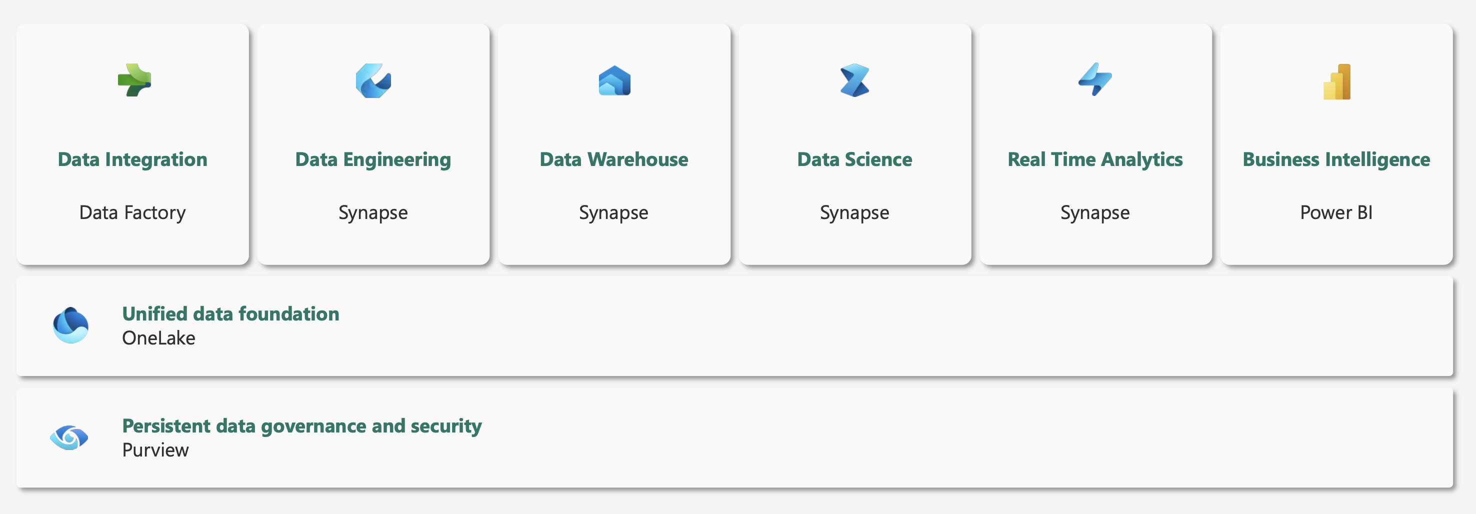
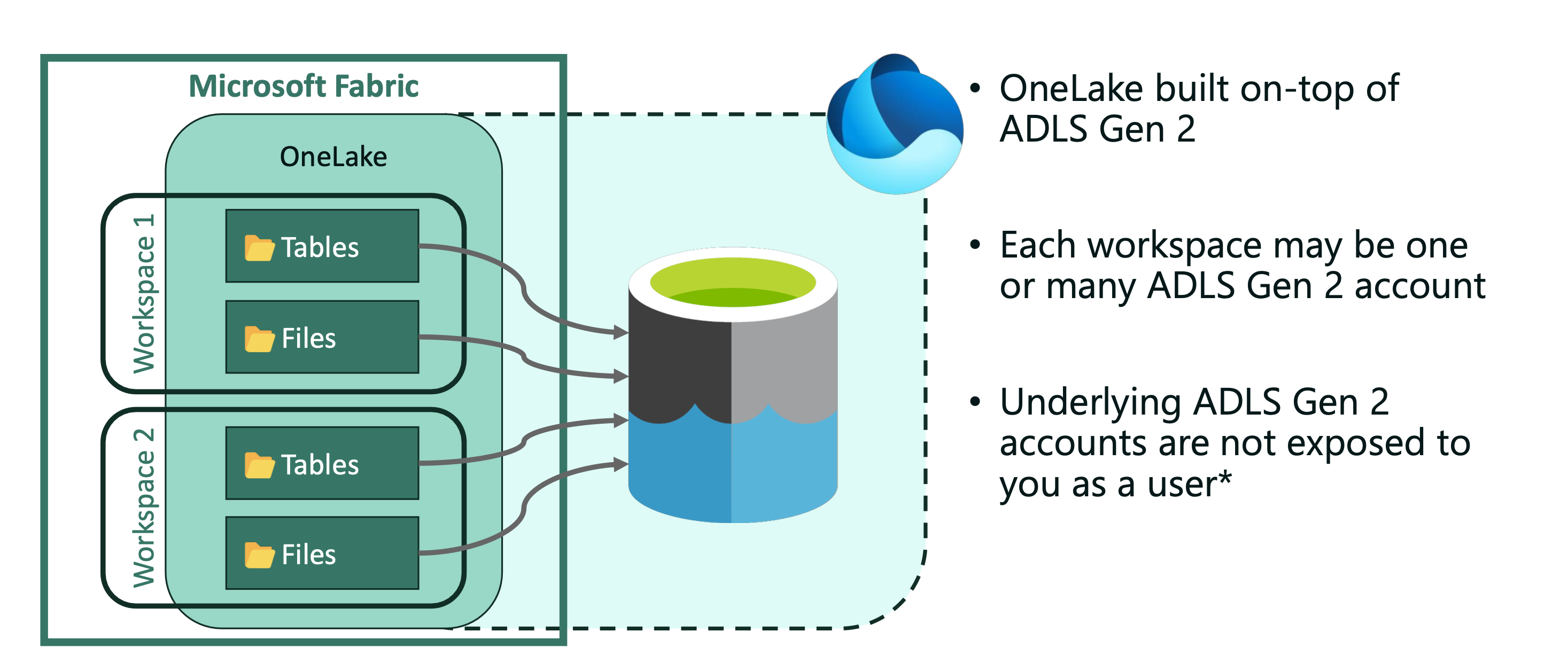
OneLake comes automatically with every Microsoft Fabric tenant and represents a single, logical data lake. Its main features are its unification and one copy of data across the organization and multiple analytical engines.
OneLake is built on ADLS Gen2 (Azure Data Lake Storage) and supports any type of files, structured or unstructured.Data warehouses and lakehouses automatically store data in OneLake in parquet format (Delta Lake, and delta parquet file format). This way OneLake makes a better shift from the Synapse experience (Dedicated and Serverless pools).
The open data format is what OneLake brings to the table. No vendor lock in and useses Delta format, in an open data lake – OneLake on highly compressed parquet files.
Support for the ADLS Gen2 APIs and SKDs makes OneLake integration even better, where you can connect to Azure Synapse Analytics, Azure storage Explorer, Azure Databricks (DFS API) and Azure HDInsight. But still the data will remain within the same OneLake, same goes for Workspaces – they will be appear as containers within storage account, and different data items appear as folders within those containers.
One copy of data
OneLake aims to give you the most value possible out of a single copy of data without data movement or duplication. You no longer need to copy data just to use it with another engine or to break down silos so you can analyze the data with data from other sources.
Shortcuts
Shortcuts in Microsoft OneLake are objects that allow you to unify your data across domains, clouds, and accounts by creating a single virtual data lake for your entire enterprise. They are pointers (with target path, security and RLS) to other storage location (Azure, AWS, OneLake) and give you Fabric experiences over all analytical engines. Each shortcut will appear as a folder in OneLake, and are symbolic representation of source data; meaning if you delete a shortcut, the origin data will remain intact. Shortcuts eliminate edge copies of data and reduce process latency associated with data copies and staging.
Some of the best-practices in OneLake
Couple of practices that might improve your OneLake experience.
Bring as much of apps, access, reports and clients closer to your Fabric; in best scenarios, collocate them
Use as much shortcuts as you want, but data that is used frequently could have a copy in sparsed format
Use CTAS instead of DELETE statements
When creating and using Domains, try to do it per business entities.
OneLake accepts all formats, but consider choosing your optimal data type for improved performance
Splitting files when using COPY INTO into smaller chunks.
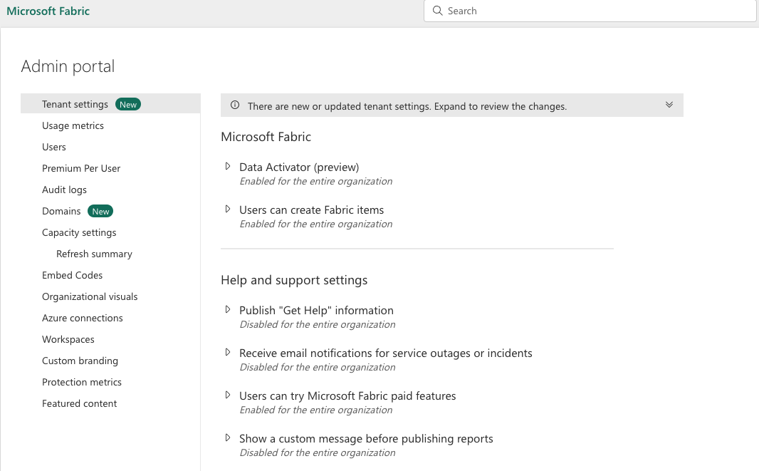
Admin portal serves purpose for governing and setting the Microsoft Fabric, where you can make tenant settings, also access the Microsoft 365 admin portal, and control how users interact with Microsoft Fabric.
To access the admin portal, not only you need a Fabric license but also admin rights with the following roles (in one of these roles; if you are not, you can only see Capacity setting in the admin portal):
Global administrator
Power Platform administrator
Fabric administrator
Let’s check the settings offerings.
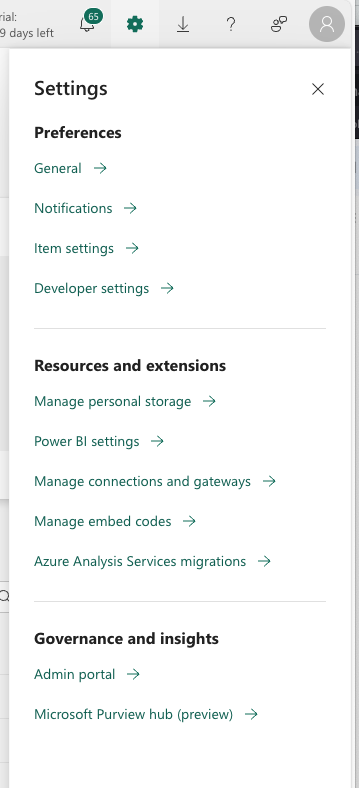
Preferences
In preferences you will mainly be able to select a language in your Fabric tenant, check the Power BI subscriptions and Power BI Alerts, and turn on (or off) the Power BI Developer mode. As well as turn on?off the use ArcGIS Maps for Power BI. You can also close the account, but must have admin priviledges.
Resources and extensions
Here you can manage your storage, manage Power BI settings, semantic models (query caching, refreshing, access, etc.), and workbooks, as well as dataflows.
Under managing data connections and gateways, you can add, edit or delete data connections, manage gateways (both on-premise and virtual network data gateways).
In Azure Analysis Services migration, you can do the migration from Azure Analysis services to Power BI Premium. It is a wizard that will help you get the migration done easier and faster.
Governance and insights
Under the Governance and insights, you will find the Admin portal and Microsoft Purview hub. We have briefly cover the Purview hub, and now let’s dig into Admin portal.
Admin Portal
Admin portal is where majority of important settings is done (one can say, “where magic happens”) 🙂
Tenant settings holds a lot of important setting and information. It has subsections and here they are:
Microsoft Fabric: where you enable the items in Fabric; Data Activator can be enabled here with it’s purpose to set a specific set of rules and when they are met, users will be notified.
Help and support settings: enable help within organization in Power BI, enable notifications for services outages, custom messages, trying new features and others,
Workspace settings: enable semantic models across different workspaces, retention period on workspaces, settings for personal workspaces and how can create workspaces
Information protection: settings on applying sensitivity labels and restricting content for exposing files to other services and tracking through Purview.
Export and sharing settings: allowing Microsoft Entra B2B users to be guests in Fabric, enabling same browsing experience for guests, setting permissions for exporting to excel, HTML, word, and other formats, allowing access to featured tables, installing Power BI in Teams, allowing add-ins for Power BI and similar content
App settings: enable users to create template apps that use semantic models built on one data source in Power BI Desktop, Enable to push apps to end users or to entire organization
Integration settings: enable XMLA endpoints, ArcGIS maps in Power BI, global search for Power BI, Semantic model execution of queries using REST API, SSO for Dremio, Snowflake, Oracle, Redshift, Google BigQuery, Exporting data from semantic model to Onelake (yaaay!), storing semantic model tables in OneLake, viewing Power BI files saved in OneDrive an Sharepoint
Power BI visuals: enabling visuals created in Power BI SDK for organization, allowing to download the custom visuals, use only certified visuals
R and Python visuals settings: enabling use of R and Python in Power BI visuals
Audit and usage settings: Enable metrics for content creators, enable per-user data usage for content creators, enable connection from Azure Log Analytics for workspace administrators
Dashboard settings: enable web content on dashboard tiles
Developer settings: enable embedding content in apps, Allow service principals to user Power BI APIs, allow creating user profiles, block Resourcekey Authentication
Admin API settings: enabling for organisation use of APIs, response APIs with detailed metadata and with DAX and mashup expressions
Gen1 dataflow settings: enable creation and use of Gen1 dataflows
Template app settings: enable publishing template apps, installing template apps and installing template apps not listed in AppSource
Q&A settings: enable semantic model owners to review questions people asked about their data, and allow to share Q&A synonyms with organization.
Semantic Model Security: enable blocking republishing and refreshing packages and only allow the semantic model owner to publish updates
Advanced networking: enable Azure private link and block public internet access
Metrics settings: Enable creating and using Metrics for users in organization
User experience experiments: enable that users will get minor user experience variations that the Power BI Team is experimenting with, such us content, layout, and design
Insights settings: enable receiving notifications on top insights and entry points for insights
Datamart settings: enabling who can create datamarts in organization
Data model settings: enable users to edit data models in Power BI service
Quick measure suggestions: enable quick measure suggestions, and enable user data to leave their geography (data processed in US and processing outside US).
Scale-out settings: enable scalling-out queries for large semantic models
OneLake settings: enable access for users to access data stored in OneLake with apps external to Fabric, and to sync data in OneLake with OneLake File Explorer app
Git integration: enable synchronizing workspace items with user’s Git Repositories, exporting items to Git repositories in other geographical locations and export workspace items with applied sensitivity labels
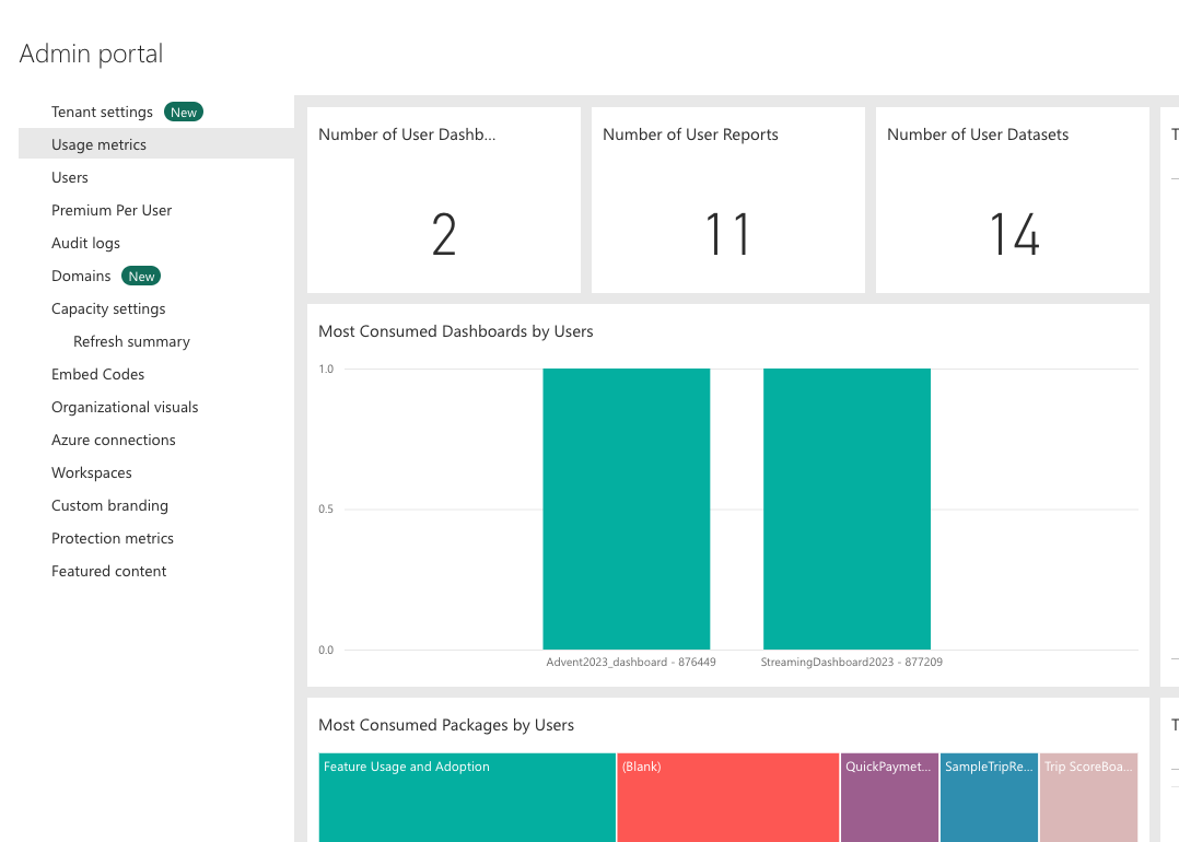
User Metrics is overview of items in workspace, user statistics and consumption by users.
Domains is a great way to tackle the grouping of all the data in an organization that is relevant to a particular area of field. When a workspace is associated with a domain, all the items in the workspace are also associated with the domain, and they receive a domain attribute as part of their metadata. This will give organization better overview for clarity, enable better federated governance (controlled on a domain-level and not only on tenant level), and spreading out the control to business departments.
Capacity settings is where you can define the Capacity SKU, capacity UNITS and regions to a particular roles, groups or units.
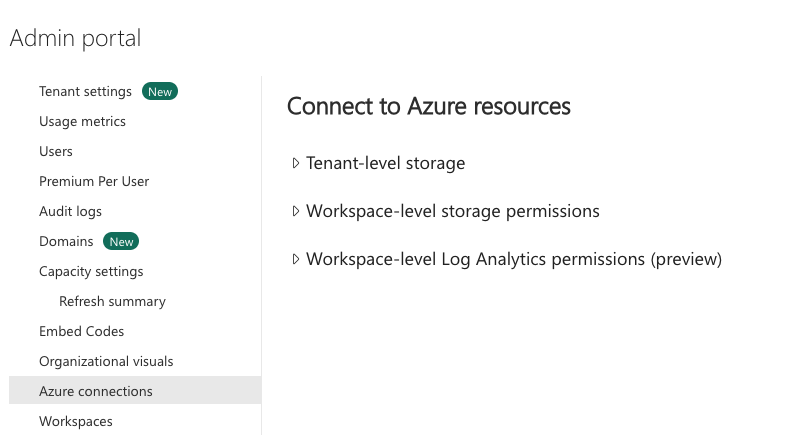
Azure connections is where you define where you can store your dataflows in your organizations’s ADLS Gen2 (Azure Data Lake Storage Gen2) account. You can set the Tenant-level storage or Workspace-level storage.
Data used in Power BI is stored in internal tenant-level storage, provided by Power BI. You can store your dataflows in ADLS Gen2 tenant-storage and access your dataflows using Azure portal, Azure Storage Explorer, and Azure APIs.
Custom branding – is where you can customize the look of Power BI for your organization.
Organizational visuals – is where you can manage Power BI visuals within your organization.
Embed codes – is where administrator can view, disable or delete the embed codes that are used for sharing reports publicly.
Protection metrics – is the report(s) for viewing Power BI sensitivity labels.
Users, Premium Per User, Audit Logs – all require Microsoft 365 Admin center access to check users, their access, Premium per User licences and Azure Logs.
Tomorrow we will look into OneLake concepts and definitions.
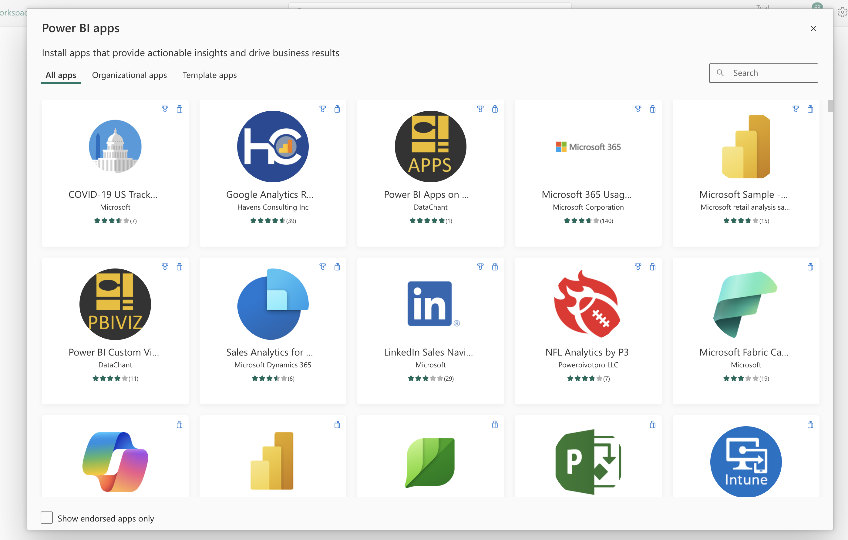
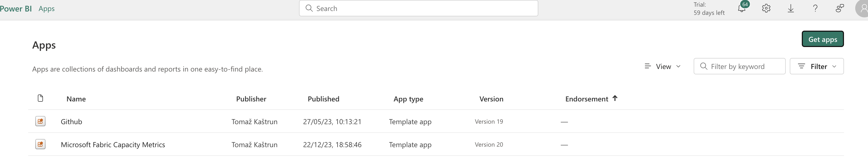
Apps are collections of dashboards and reports in one easy-to-find place. Go to Apps and click on “Get Apps”.
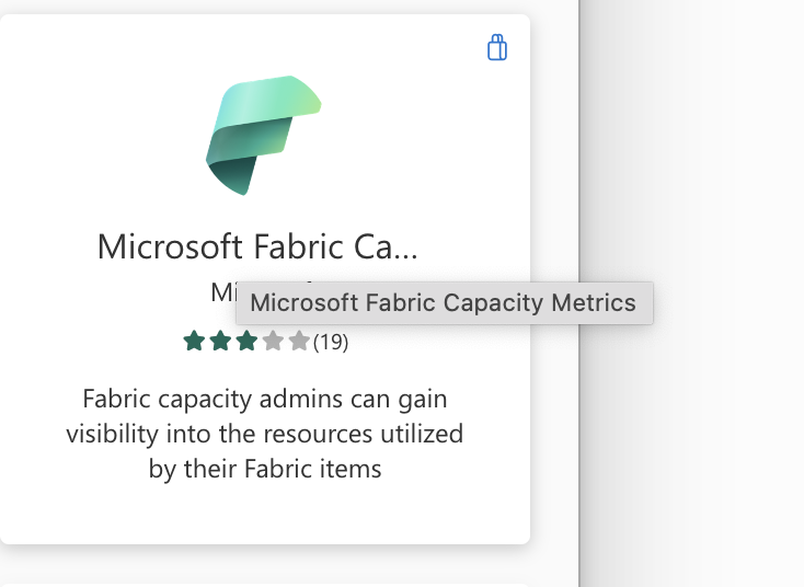
Click the Microsoft Fabric Capacity Metrics tile, click on “get it” and later click on “install it”.
The App will be added as an app to your tenant and it will feel and see like an Power BI report.
Upon the first run of the Capacity Metrics App, you will need to insert the Capacity ID (You can get the Capacity ID in the Admin portal), connect and do the authentication.
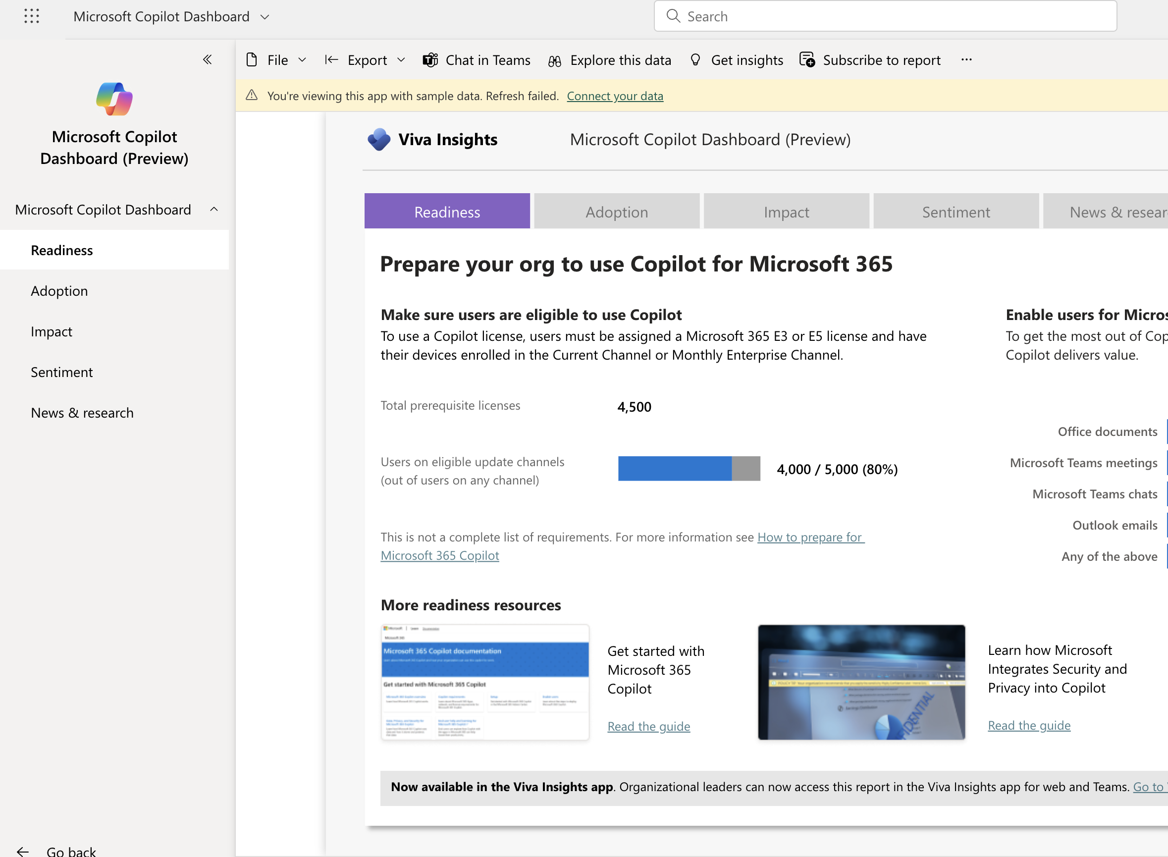
There are a lot of different Apps available. This is an example of add for Copilot:
Apps are represent a rich repository of different collection of reports and dashboards that will suit your needs.
Tomorrow we will look into Admin Portal and make a segue to OneLake.
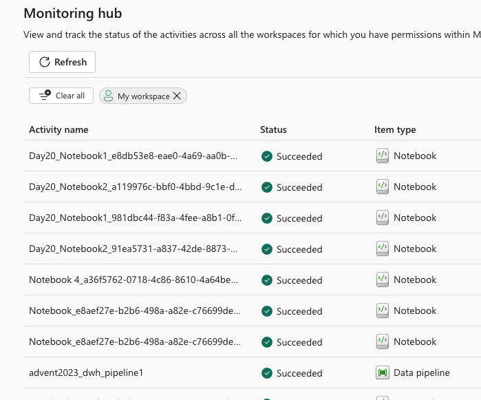
Monitoring workspaces, executions and checking logs is so quintessential, that one should get familiarized with this in the first place.
Monitoring Hub
The easy way to check, view and track your activities and execution and runs of notebooks, data pipelines, data factory executions, datasets refresh, and many others.
With filters and using search, you can find the desired logs and check the the details.
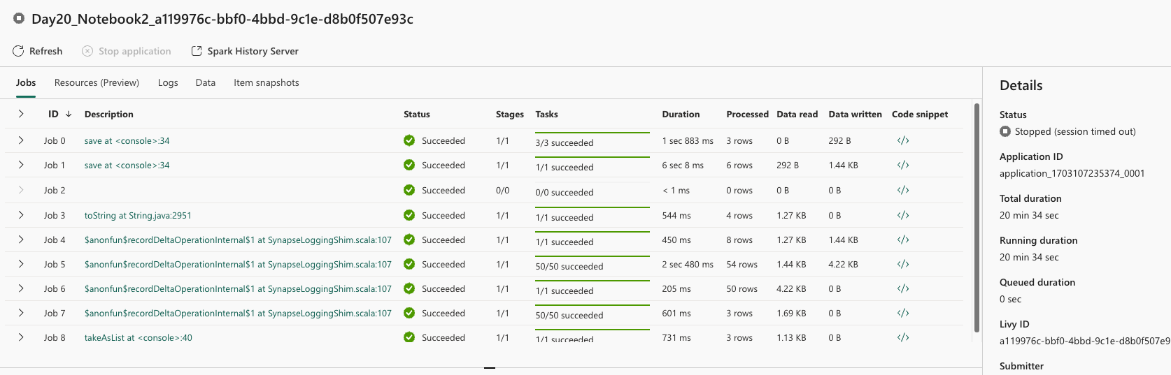
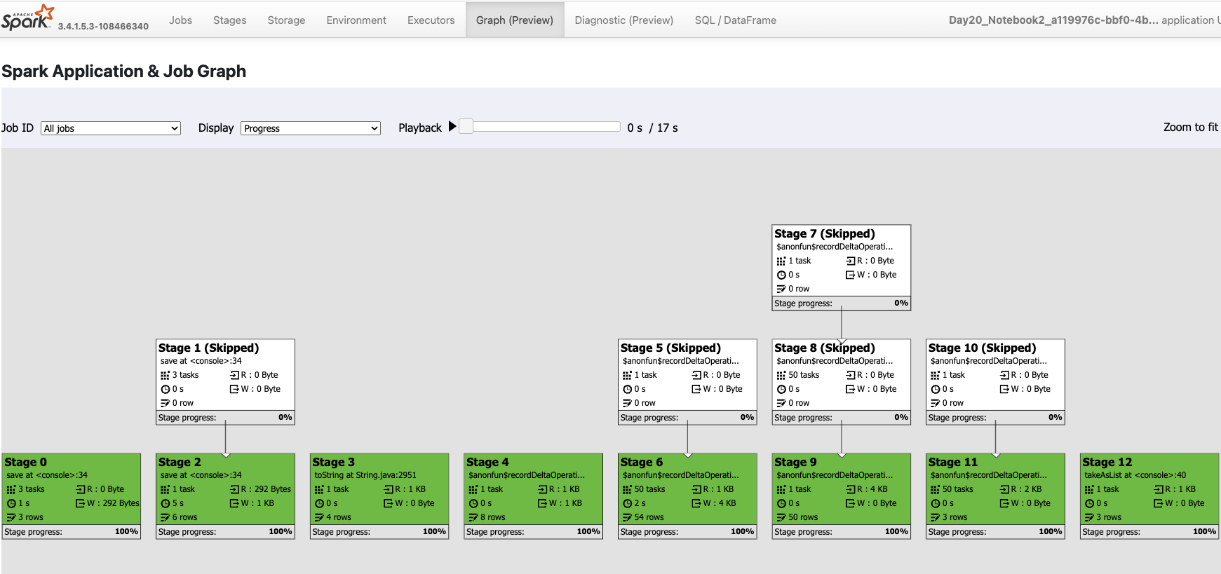
For example, check the notebook executions(which are run on Spark architecture) and double-click on the ellipses, you will get detailed information on the Spark engine, job runs, resources used, data touched (used, created,…) and snapshot items.
Should you want to examine each job run, you can double-click it and the Spark UI will open. You will be redirected to a standard URL: https://sparkui.fabric.microsoft.com/sparkui/ where further data will be displayed. Fabric Spark UI will behave as your normal Spark UI and will get the exact same experience as with any other Spark installation. And I am personally happy that Fabric gives you all these capabilities to dig deeper into Spark. And for a particular run you can go deep into the details as Spark has to offer. For example, previewing the Spark Applications and Job Graph.
Several of these diagnostics are also available within the notebook. After each execution of the cell (in the notebook), there is Log, Diagnostics and Job Runs information available and the same information can be shown as these in Spark UI.
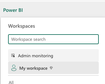
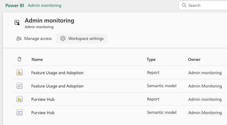
Admin monitoring workspace
Admin workspace is available when you are granted the privileges.
Within this workspace, you will have the feature Usage and adoption, as well as the Purview Hub (Yaay! 🙂 )
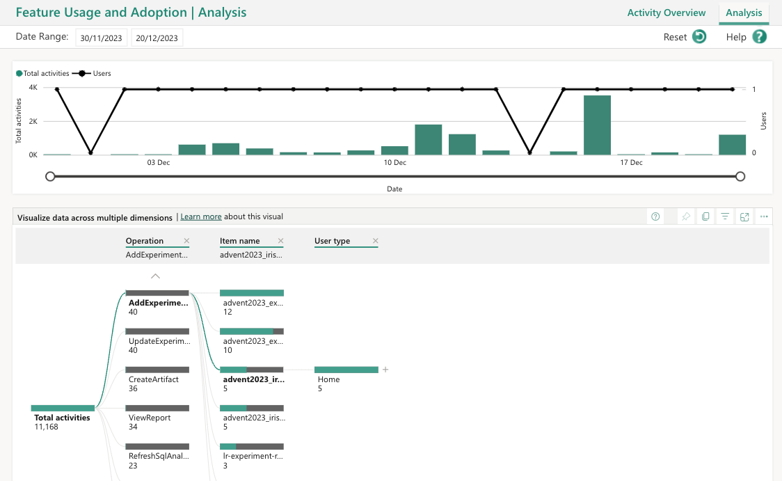
You will have an overview of feature usage within your tenant. Besides activities, you can also check the analyse the usage activity logs in details.
Dataset and the report can always be edited, upgraded or tailored to your need.
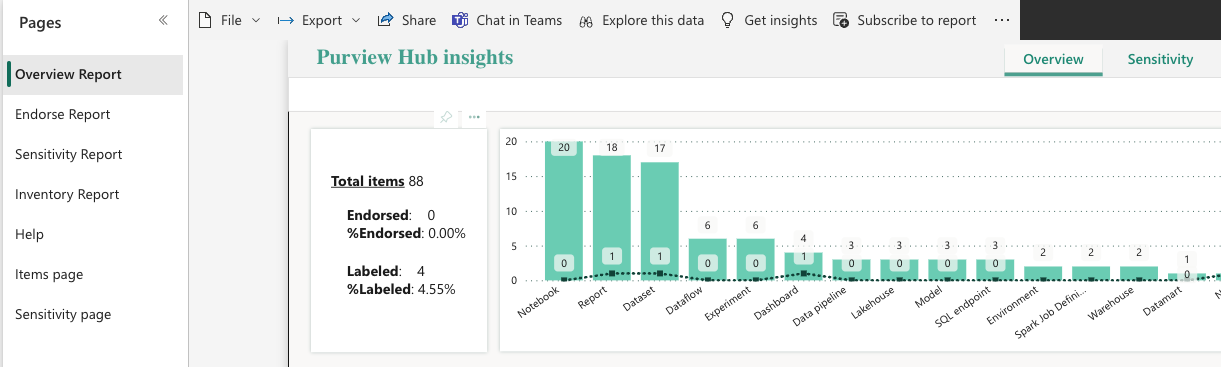
The Purview hub report gives you the ability to check:
Overview report: Overview of distribution and use of endorsement and sensitivity labeling.
Endorsement report: Drill down and analyze distribution and use of endorsement.
Sensitivity report: Drill down and analyze distribution and use of sensitivity labeling.
Inventory report: Get details about labeled and endorsed items. Can apply date ranges, filter by workspace, item type, etc.
Items page: Insights about the distribution of items throughout your organization, and endorsement coverage.
Sensitivity page: Insights about sensitivity labeling throughout your entire organization.
Accessing purview and getting hands-on Purview is worth couple of blogposts and covers variety of super important topics, that should be relevant for every enterprise!
User Activity
Tracking user activity is not that straightforward in Fabric. One can use the Power BI Powershell modules to track the activities in workspaces, users, and all Power BI Items. This can be done using cdmlet:
Get-PowerBIActivityEvent
or Audit log in the Admin portal. I have written extensively using Powershell for Power BI (Blogposts; Github Repository). But this can also be used against all other Fabric items but only for CRUD operations.
And if you want to check all the user sign-in activities, Entra ID (or formally known as Azure AD) is also a good starting point.
Notebooks have been around for a long time and people, community, and professionals have proven the usability, practicality, versioning and reliability of notebooks. Not to mention the clarity and hygiene. But opinions are also divided.
The purpose of this post today is to check for a couple of functionalities that might not be that straightforward when it comes to notebooks.
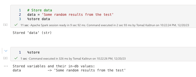
Passing variables among notebooks
The usual way is to store the values in the session and later call the value using the %store. Within the notebook, this works like a charm and the “data” variable displays the value in the next cell.
When called the %store from another notebook, the store is shown, but empty:
The traditional way can not be achieved this simple. However the intermediate results can be stored in a persistent file and later read.
Storing and reading from file
You can store the results in a file within Fabric. I will have the Spark session created and stored as a random data frame. The data frame must be a spark data frame (not e.g.: Pandas), so if the transformation is needed, you must do it.
And this file can be later read in a simple manner. Note that a header and delimited are not included in this sample, but when dealing with real data, you should include these parameters as well.
Widgets are great but with the lack of installations within Fabric, I – at the time of writing this blog post – could not have the package (ipywidgets) and the underlying engines (node.js) properly installed on Lakehouse in Fabric. I have used the simple Widget package. If I have missed out the way, or overlooked something, please be so kind as to post the solution in the comments section. 🙂
I must note as well, that I have tried using the different spark sessions, environments and engines but could not get it up and running.
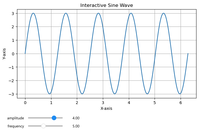
Dynamic graphs with sliders
Using matplotlib and widgets, you can set the graphs with sliders, that will be changes / regenerated, based on selection. And here is a simple example:
import matplotlib.pyplot as plt
from ipywidgets import interact
import numpy as np


def interactive_plot(amplitude, frequency):
    x = np.linspace(0, 2 * np.pi, 1000)
    y = amplitude * np.sin(frequency * x)
    plt.figure(figsize=(8, 4))
    plt.plot(x, y)
    plt.xlabel('X-axis')
    plt.ylabel('Y-axis')
    plt.title('Interactive Sine Wave')
    plt.grid(True)
    plt.show()
Once you have the graph initiated, you can run the interact function:
The two sliders: amplitude and frequency under the graph will re-render the graph, based on the slider selection.
Conclusion
I have been a fan of notebooks and worked with Jupyter Notebooks, R Quarto notebook, Databricks notebooks, and Julia-based Notebooks, and many different software (Markdown, Nteract, Visual Code,…) And cherry-picking the best features (most likely from quarto and Databricks), I have seen there is still much more room for improvement for Fabric notebooks. Just to name a few:
passing variables between the notebooks
setting up the master / main values from dropdown that get’s propagated to one cell (e.g.: graph or table) or complete notebook.
better code interaction, code notation and results handling
Results handling and switching between the result set displayed in dataframe and ability to transform dataframe to graph.
Inline text writing
Export the results or creating PDF, PPTX out of notebook
Building a book / hub of all files and being able to add metadata to the notebook and “book-like” table of content would be very useful
Tomorrow we will look into monitoring of workspace.
we will get a semantic model that can be used in Dashboard or in Power BI. The model with its logo.
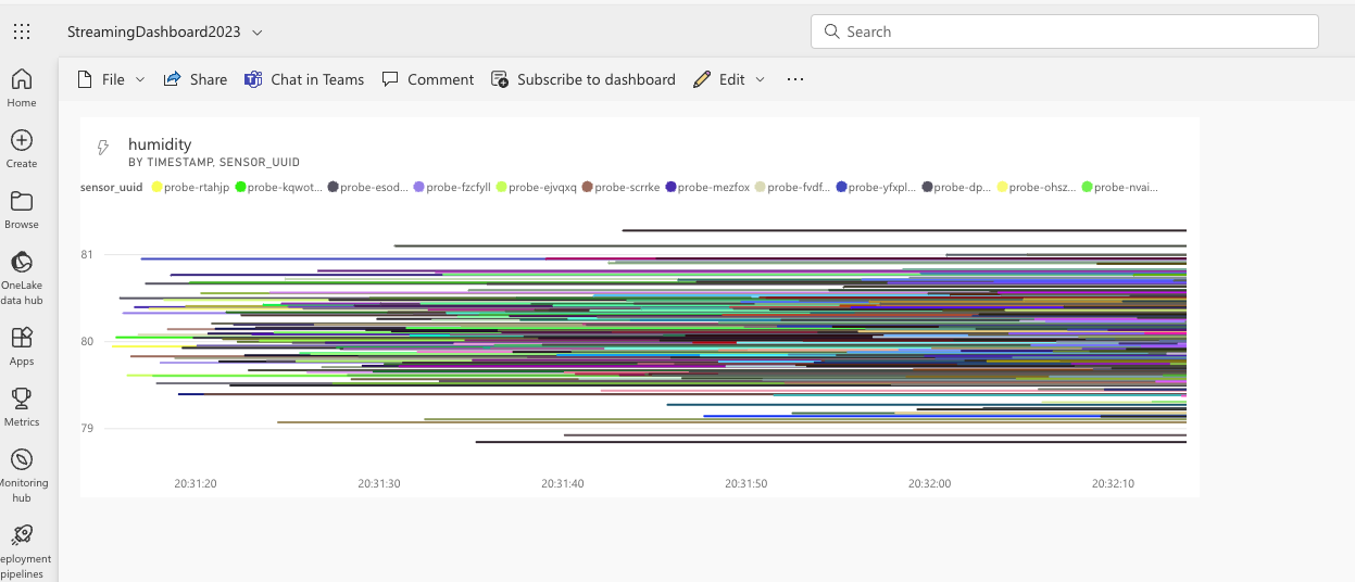
Once you have the PubNub API being consumed into the model, we can create a dashboard and add graph. Watch it in real-time to see the data being populated.
We have created a Power BI report directly from the datalake and today we will check how to do same with dashboard and paginated reports.
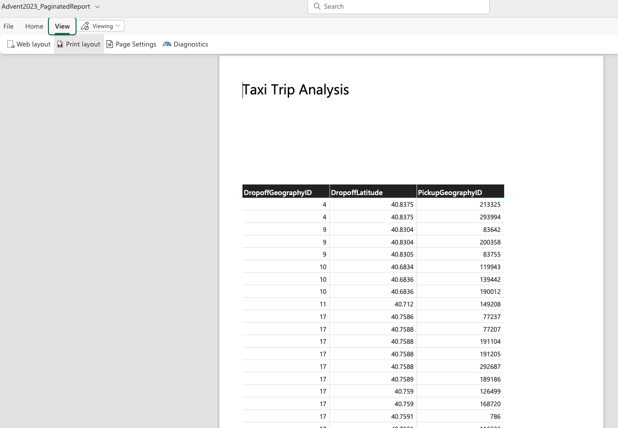
Select new “Paginated report”. Select a data we want to connect to - in this case my “Advent2023_DWH” and click “Create paginated report”.
The familiar outlook, and start building the report. I have created a simple table view of data, to keep the report simple. You will see that the report creation is super simplified to the functionalities and capabilities you have, when using the Report builder. Once you create a report and give it a name. I am calling mine “Advent2023_PaginatedReport”.
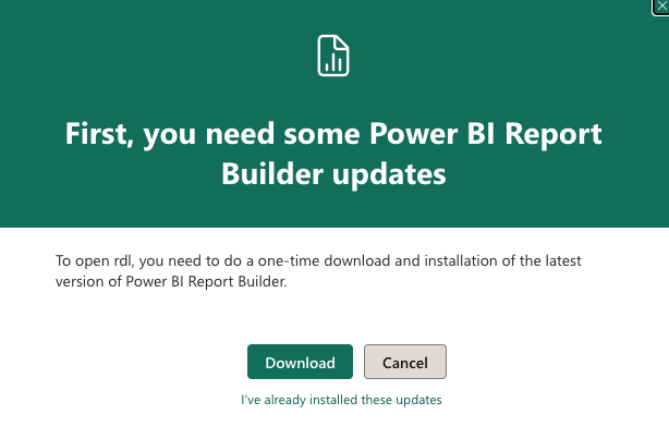
Later, if you would like to update the report (as you can see, it does not contain more than just a table of transactional data), you will be greeted with the message:
So, you will need to download the report first, install the Power BI report builder and do all the fine stuff in the report; like: parameters, filtering, adding other visuals, etc.
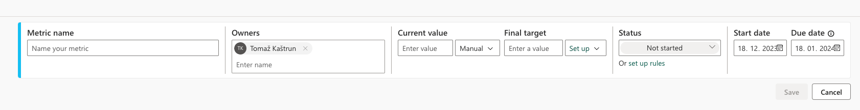
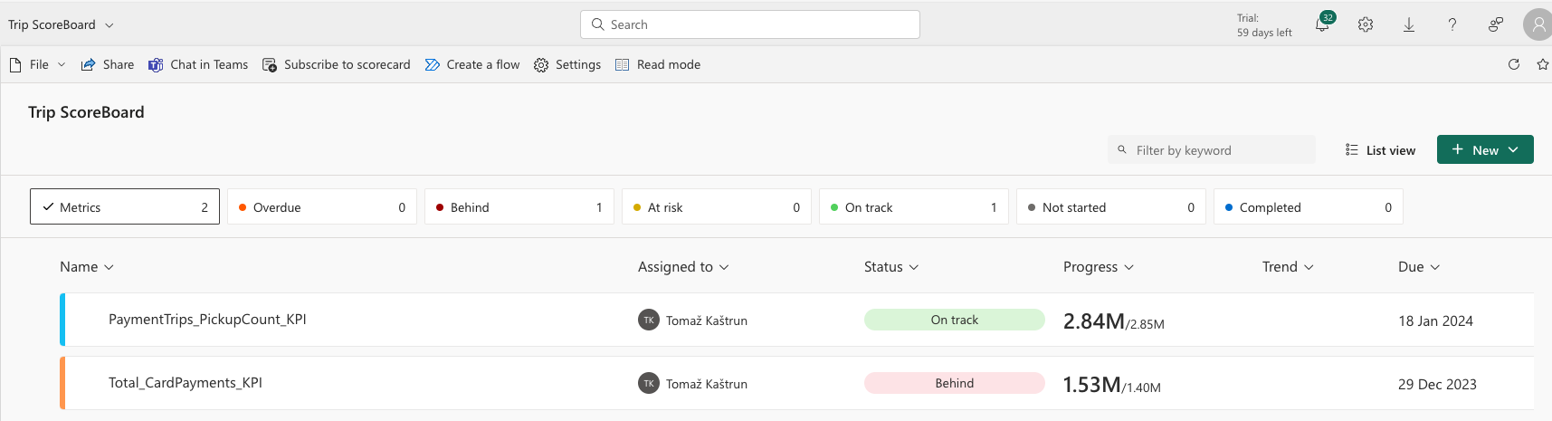
One can also create scorecard in Fabric. Scoreboard is a single pane view with one or more multiple metrics (KPI). Go to new and select “New scorecard”. You can create a single or multiple metrics for tracking key business objectives.
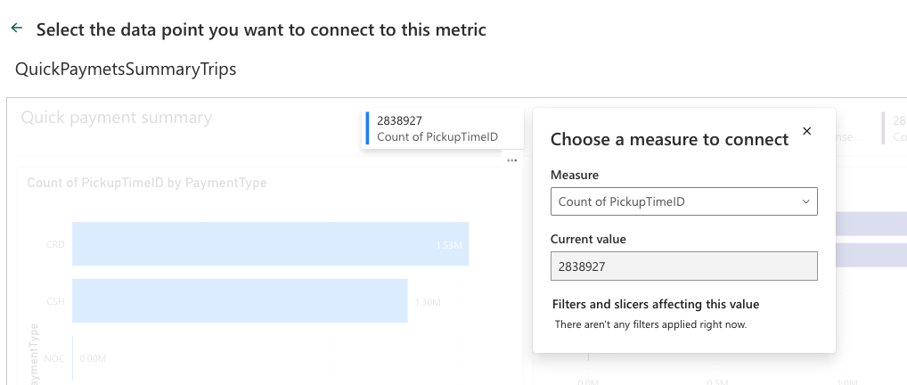
You will be able to assigning a metric / Scorecard to your semantic model. And instead of entering the values manually, I will connect the metric to data. So select “Connect to data” and find the value you want to extract and have it placed on a single pane among others:
Adding the final value you want the metric to be achieved and click save. I have added additional metric. And all are connected to the main
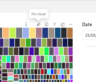
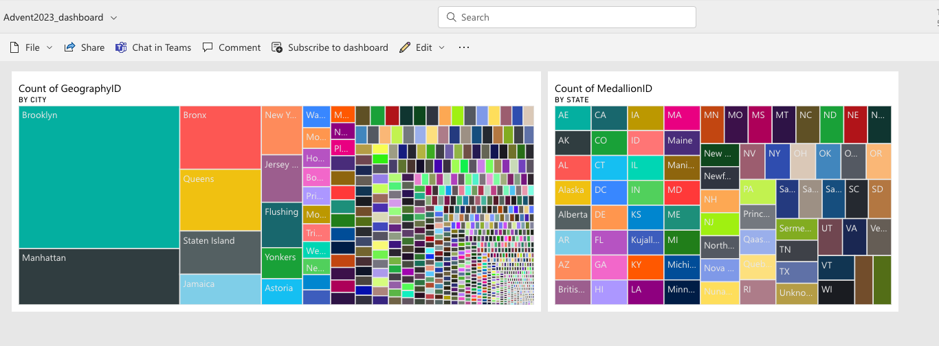
And lastly, the dashboard. The dashboard is a single page, often called a canvas and it gives one page information with well-selected tiles that can highlights the business story. Readers can view related reports for the details.
By adding tiles to dashboard, the simplest way is to open an already created Power BI and click the Pin icon to pin a visual and you can select the desired dashboard.
By doing so, you will be able to get the desired visuals from different reports on a one-page view.
Tomorrow we will looking into the event streaming.
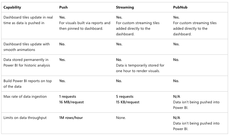
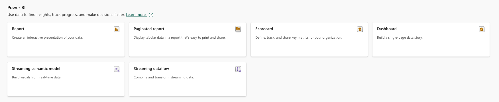
Within the Power BI in Fabric, you will find many of the components, that can be used to create a final report. And here are the components:
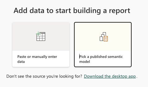
Let’s create a report online within the workspace. You will get your two options to start (and “Paste or manually enter data” is kinda contradictory in the world of data lakes 🙂 ) But select “Pick a published semantic model” coz my money doesn’t jiggle, it folds 🙂
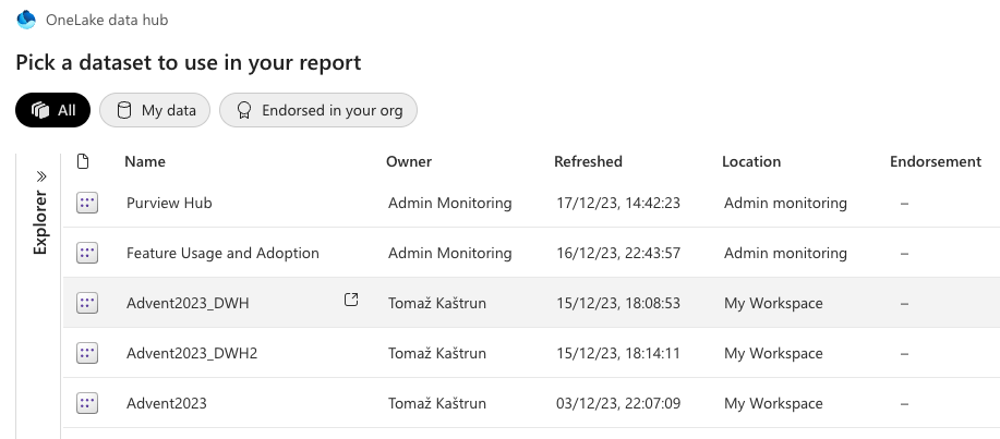
And you will be presented with the complete OneLake data layer, picking the data from anywhere, you desire (DataLake, Datewarehouse, datasets, …). I am selecting the Advent2023_DWH dataset.
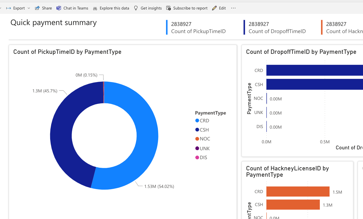
And you can have a report created automatically or manually. Let’s go with manually creating it. You will be presented with regular Power BI outlook and the data are the exact same tables from the warehouse, we have created in previous days. Also the table “SampleIngressDWH” from yesterday’s data copy using notebooks, is here.
Make sure to have all the relations between the tables created! Once you are finished with creation, save it and you are good to go.
Tomorrow we will looking into the Paginated reports, scorecards and dashboards.
100% of donations made here go to charity, no deductions, no fees. For CLOWNDOCTORS - encouraging more joy and happiness to children staying in hospitals (http://www.rednoses.eu/red-noses-organisations/slovenia/)
sharing my experiences with the Microsoft data platform, SQL Server BI, Data Modeling, SSAS Design, Power Pivot, Power BI, SSRS Advanced Design, Power BI, Dashboards & Visualization since 2009