Having as much possible Power BI estate when it comes to putting the visuals for data exploration, is everyone’s dream. But the slicers for “slicing and dicing” the data is also very important. Having all the slicers hidden has always been mine go-to design.
Several similar ideas have been shown, Guy in a cube (Adam and Patric) have both done similar ideas over past years, many questions have also been answered on Power BI community website. And mine requirements were similar:
- have the ability to hide the filter pane
- have the selected slicer items listed
In general, what always bothered me, was that left or upper side of Power BI Page would always hold the slicers and selections, which might make page slightly crammed and hence rather unclear.
1. Getting data
Diamonds data-set is available at Github. Another way to get this data-set is with R script:
library(ggplot2)
attach(diamonds)
write.csv(diamonds, file="diamonds.csv",sep=",")
Once you have the data, let’s start digging in Power BI. In general, we will create two main things: 1) hidden filter pane and 2) filter selection cards.
2. Creating custom filter pane
First, we will need to get the data into Power BI. Once you add your desired visuals on the page, we can start with creating the filter pane.
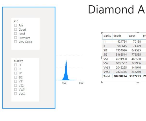
1) Add a shape on Page, in the case of this example, the rectangle
2) Add the slicers for the data to be “sliced and diced”. In case of this example, we are adding two: Cut and Clarity. So it should look like this:
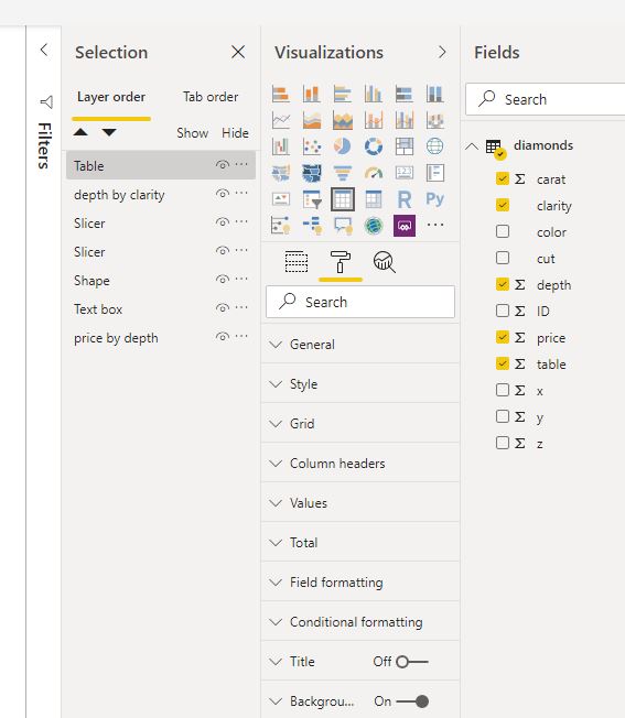
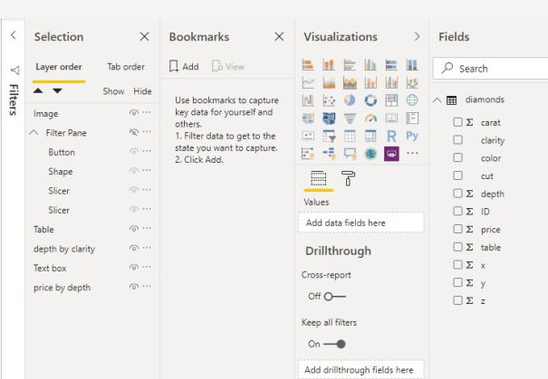
 Now we need to give it a little bit of logic in order for the pane to work. Under view, select the pane “Selection” to be viewed besides the Visualization and Fields pane.
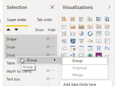
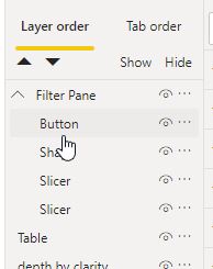
3) Group the elements: Shape, Slicer, Slicer:
And rename it to Filter Pane.
4) Under Insert, go to Buttons and add Back (Back button) to the Filter Pane, and it will be automatically grouped.
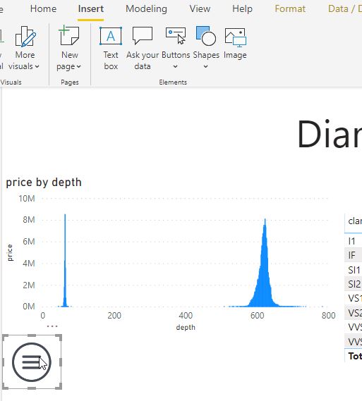
5) Add an Image or Button or any type of placeholder for your user to be able to show (invoke) the filter pane (menu icon is also available on Github). So adding the image on Power BI Page and placing it where the user will be able to see it and use it easily.
(Note: At this time, the shape with both slicers and back button is hidden).
6) We will create Bookmarks for both: a) shown filter pane and b) hidden filter pane. Under menu View, select Bookmarks.
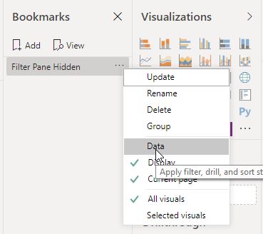
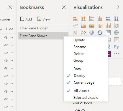
7) Create new bookmark with Filter pane hidden. Rename it as “Filter Pane Hidden” and click the ellipsis and uncheck Data (as shown on print-screen). This will not apply any selected slicer values when hiding or showing filter pane (clicking the bookmarks).
8) Create another new bookmark with Filter pane shown. Repeat all the steps as with the first bookmark.
By clicking on the bookmarks, you should be able to see the filter pane appear or disappear.
9) With both bookmarks created, now we need to assign both bookmarks to menu button and to back button. Make sure you have the filter pane hidden. Click on menu image (1).
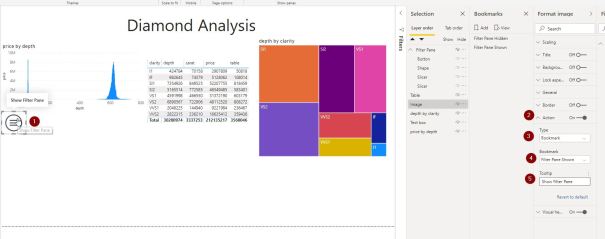
Under the Format Image, select Action (2), Change (3) Type to Bookmark and select (4) Bookmark “Filter Pane Shown”. Optional, you can add (5) Tooltip as a caption to the menu image.
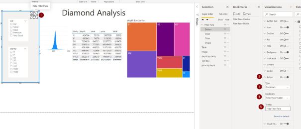
10) Repeat for the Back Button. Make sure you have selected the “Filter Pane Shown” bookmark. Click the (1) Back button and under the Visualization, under (2) Action, select (3) Type Bookmark and select (4) bookmark “Filter Pane Hidden” and optional add the caption for the back button under (5) Tooltip.
Before going into testing the bookmarks, make sure you have the correct order of objects in Layer order under the Selection Pane:
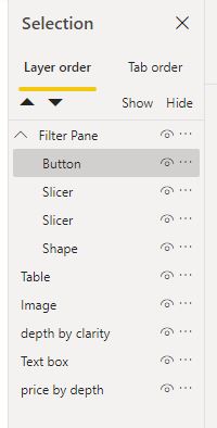
In this Layer ordering, when opening Filter Pane it will always be on top, regardless of objects underneath the Filter pane.
To test the Menu, Filter Pane and Bookmarks, make sure you hit CTRL + mouse Click. This way you will invoke the filter pane.

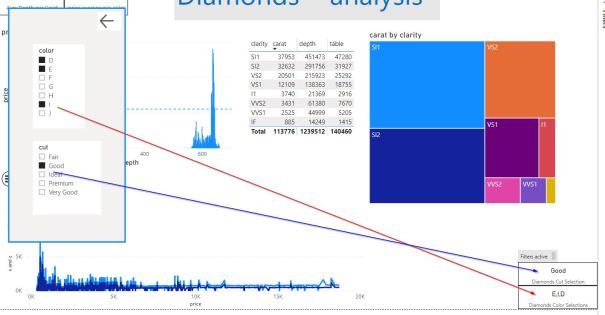
3. Show selected filters
Now that we have the filters hidden from the users, it would be also fair, to have the information about the selected filters in form of a card, available for the end users.
For both slicers (cut and clarity), I will add a card visual for each.
Create new measure and add DAX:
Diamonds Cut Selection = IF
(
  ISFILTERED(diamonds[cut]);
  SELECTEDVALUE(diamonds[cut]; "Multiple cuts selected");
  "Filter not selected"
)
Diamonds Clarity Selection = IF
(
  ISFILTERED(diamonds[Clarity]);
  SELECTEDVALUE(diamonds[clarity]; "Multiple colors selected");
  "Filter not selected"
)
Diamonds Color Selections =
   VAR Conc = CONCATENATEX(VALUES(diamonds[clarity]);
               [Diamonds Clarity Selection];",")
RETURN(Conc)
This combination will concatenate the selected values, so that the end users will be able to see the list of all selected values.
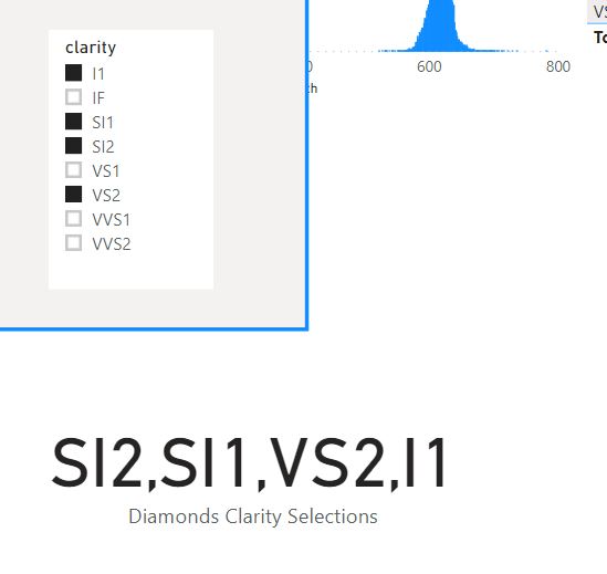
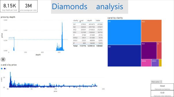
At the end both results are seen as (and some additional design enhancements):
Code to this example is available at Github.
Happy DAXing!


[…] Tomaz Kastrun walks us through creating a custom filter pane in Power BI: […]
LikeLike
thanks for this. really helped. however there is an issue when exporting pdf with current values when the filter pane is “hidden”. it prints the data with the default values and not the applied filters.
LikeLike